Alex Hogrefe is the creator of Visualizing Architecture, a blog dedicated to educating people in the art of architectural visualization. He is also part of rendering studio Design Distill, generating unique and compelling illustrations for architects around the world.
One of the questions I get asked most is: How do I compose perspective shots? I have touched on this subject in past posts but have not organized these concepts into one place. The tips discussed below are by no means the law. There are often circumstances that limit how much the below rules can be or should be implemented, and I break them all the time. But still, I often start with these ideas as a jumping off point.
1. Follow the Rule of Thirds
The rule of thirds is one of the more well-known photography rules and is one that I use most often. Divide the page into three sections both horizontally and vertically creating nine squares. From there, compose the image so that important moments or focal points fall along the lines or at their intersections.
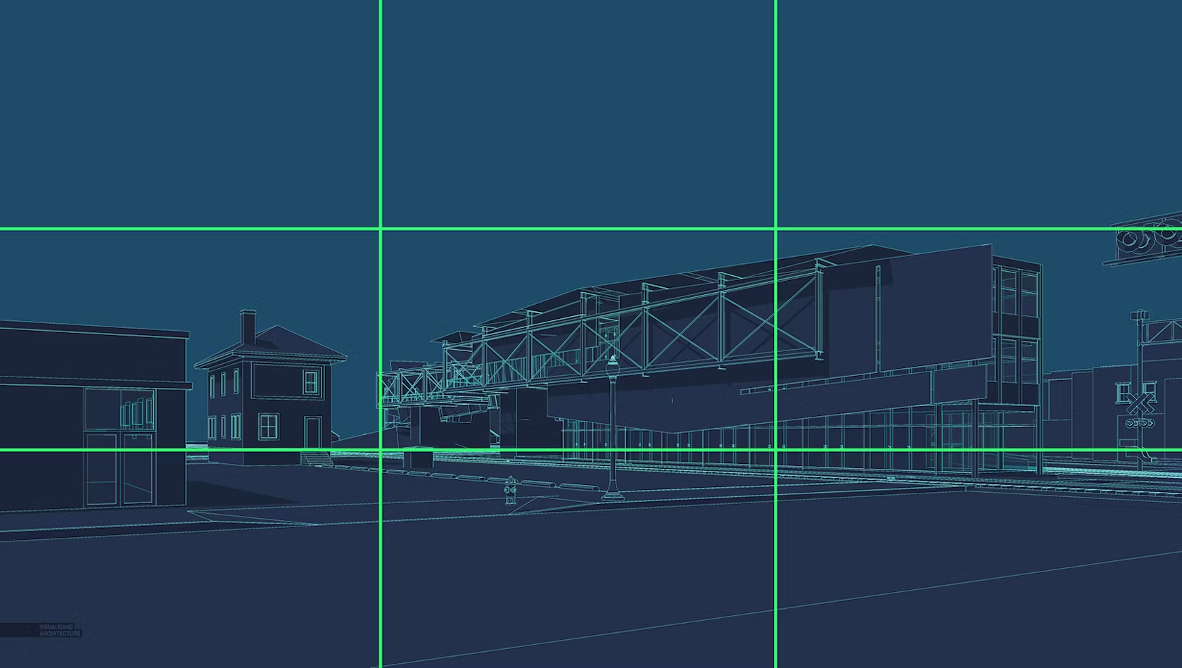
I often place the horizon line of eye level views on the bottom third of the page instead of directly in the center of the image. Above, you will notice that other important elements land on the lines, too, such as the end of the train pavilion and the railroad crossing lights to the right.

Placing the horizon line on the top third of the page also works for low bird’s-eye shots.

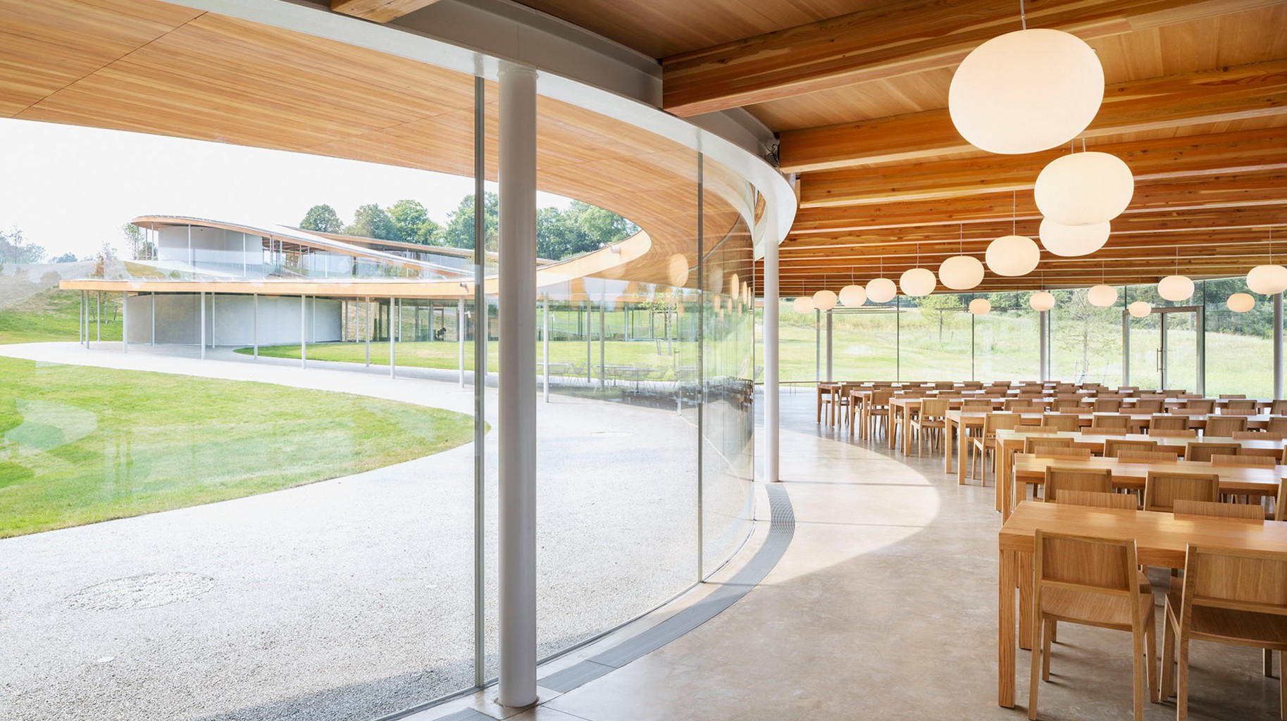
The rule of thirds also works great for interior shots. In this case, the perspective lines converge on the bottom right third of the image. Secondary alignments occur with the beams on the top third and left third.
2. Switch to One Point Perspective
In other words, set the camera perpendicular to the structure, essentially generating a perspective elevation rendering. Though this type of image sometimes comes off as a little static, it can be a good complement when paired with more aggressively composed images in a series of illustrations. I often implement one point perspectives when I want a place to feel a little more subdued or monumental.

Above, the camera is placed perpendicular to the train pavilion bridge. This creates a lot of horizontal and vertical lines in the image as opposed to diagonal lines dominating the composition.
3. Master Centering
Centering is hard to pull off, but when done well, it can generate a really compelling image. The focal point of the image is placed directly in the center of the image and is hierarchically stronger than all other elements of the composition.

Above, the image is not perfectly symmetrical but still has a balance to it. The surrounding context is lower, but equal in height, drawing the eye to the center of the image.
4. Let Nature Dominate
In some cases, it is less about the architecture and more about the context. In these situations, the horizon line is moved very low, giving a lot of image real estate to the sky. The same can be done with the ground plane moving the horizon line high in the image, playing up the landscape and minimizing the architecture.

The landscape and more specifically the sky now have a pivotal role in this image instead of acting as a background to the architecture.
5. Get Intimate
All too often, images try to cover too many objectives by telling multiple stories about the design. This leads to weaker images because the focus is on “checking boxes” instead of choosing a view that compositionally is better or that connects well emotionally. Instead of pulling the camera out further and further to get in as much information as possible, move closer and focus in on a single idea.

For the above Cliff Retreat image, I could have included a lot more elements of the design such as the grand stair, the ground level deck below, etc. However, I instead focused on one idea, which was how the cantilevered viewing platform projected out from the cliff and the contemplative space that this created.

Even though there is a lot going on in the above image, there is still only a single focus, which is how the street connects to the monumental stair slanting up the culture center plinth.
6. Correct the Verticals
Most, if not all, architectural photographers follow this convention because it is considered a more accurate representation of the architecture. It is simple to execute and adds another level of refinement to the composition. The adjustment is usually made in eye level and low bird’s-eye views. Also, images with really tall buildings like skyscrapers will typically have the verticals corrected.

For shots at eye level such as the one above, often the vertical lines will converge (angle left or right) the further the camera looks up from the horizon.

The above image shows the vertical lines corrected. There are multiple ways to do this. I typically set my 3D model software (SketchUp) to “Two Point Perspective” before rendering, which solves this problem. However, if the image is already rendered and edited, you can make the correction in Photoshop. I created a tutorial a long time ago describing this process.
7. Don’t Be a Giant
If you are going to create an eye-level view, set the camera height to around 6 feet to better connect the viewer to the experience of being at that space. People often rationalize that they want to better see the ground plane, so they raise the camera to just above head height at 8, 10, 12 feet, etc. However, this makes for an awkward and uncomfortable composition. This rule does break down a bit if you are dealing with extreme sloping sites or standing on a terrace or balcony.

For the above image, the camera is set around 10 feet above the ground. It is hard to tell if the camera is placed on a balcony, if it is being held by a giant or being taken by a low-flying drone. It is important to clarify the intent by either dropping it to eye level or raising it up to 25 or 30 feet.

Here, the camera is set at 6 feet and gives a better sense of being in the space among the people.
When composing an image, there are so many variables to take into account that it can be somewhat overwhelming. Ideas on composition like the ones above help simplify the thought process and speed up the initial camera setup.
This post first appeared on Alex Hogrefe’s blog Visualizing Architecture. Enjoy this article? Check out the other features in our series on “The Art of Rendering”:
Architecture encompasses more than just buildings; it starts before construction breaks. Architizer's 2025 Vision Awards celebrates conceptual work and architectural representation. July 11th marks the end of the Final Entry period — click here to submit your work.