
Architizer's 2025 Vision Awards puts the spotlight on architectural representations — from conceptual work to photographs and videos to drawings and more. The Extended Entry deadline of August 1st will be here in no time, so start your submission today.
No matter how immersed we get in the technical and artistic aspects of architectural visualization – the reasons why most of us get into the field in the first place – there is no way around the fact that the quality of the final image largely depends on the relationship we have with our clients.
In partnership with
![]()
When starting a rendering project, there are a number of ways that you can foster a strong connection with both your client and your subject matter, allowing you to develop powerful imagery that resonates with both clients and a wider audience. Below, explore 7 in-depth tips that will help you on your way to creating more compelling architectural visualizations, and permanently enhance your portfolio in the process.
1. Know thyself (and your client).
The question ‘Who are our clients?’ inevitably leads to a more important one – ‘Who are we?’. The underlying reality beneath fee and timeline negotiations, are expectations on both sides which will define the work to a great extent. Perhaps you run a studio that has developed a recognizable visual style, which is why the client has chosen to work with you. If you’re a firm that produces quality work that’s more malleable to clients’ tastes, it becomes essential to define expectations early on. Although the importance of researching clients can not be overstated in either case, it is especially pertinent to the latter.
In my own experience, the dynamic of the collaboration depends on whether you work with architecture studios or developers. Established architects tend to be more open to experimenting with composition and lighting. Here is a chance to go nuts with the fog and have 90% of the image be of meadows, forests, riverbeds. The visual style will also be informed by geographic market within which the client operates.
We all know what type of atmosphere Scandinavian studios favor (if you browse through the internet for Scandinavian exterior and interior images, you’re unlikely to come across a hyper-saturated render with a carnival-like atmosphere). On the other hand, developers from oil-rich Middle Eastern countries who love their grass super-green, night skies star-bespangled, and panoramic skylines reminiscent of a utopian version of Blade Runner. Developers in general tend to favor more saccharine visuals partly because their client-base consists of property buyers/ visitors.
With this in mind, let’s move on to what gets our creative juices flowing, both in terms of technology and art.
References for IRACEMA by Tresde / Santi Sanchez
2. Find good references.
It’s common knowledge that having good references at the start of a project can make a huge impact on the quality of the image. Photographic references will make your life much easier; they will get your eyes accustomed to how things work in nature.
However, keep in mind that most professional photographs are manipulated in post, and often include the use of additional behind-the-camera lights. This is why you have to figure out which effects you can achieve in 3D and which you should add later. Recreating photographs can be a great exercise in honing your 3D skills and training your eye.
Model for Nasu Tepee House by Hossein Yadollahpour via Ronen Bekerman
3. Master your model.
You don’t have to have a complex 3D model to get a good result. While some prefer to do as much as possible in 3D, others like to create basic volumes in 3D and have the magic happen in postproduction. I myself have found that having a good, detailed 3D model allowed me to respond quicker to design and compositional changes, though this can be attributed to my average-to-poor Photoshop skills.
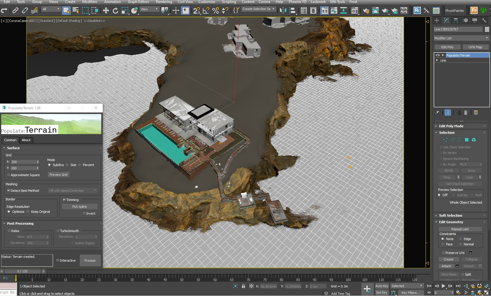
Optimize your scenes. Use layers. Attach all repetitive objects such as doors, railings, windows, window glass and walls. If you’re working on a masterplan, consider converting buildings to proxies to spare your RAM. If your scene is geometry-heavy, make sure to simplify its viewport preview. Check every model you download and merge into your scene– these can be ridden with unused helpers, dummies, missing plugins and incorrectly named textures. Use scene-optimizing scripts and plugins (I myself use StrTools, RelinkBitmaps and SiNi Software Forensic scene checker, among others). There are many available scripts and plugins that can help streamline the modeling process.

Image via Dabarti Capture
4. Bring everything organic to life.
If you rely heavily on 3D, you should dedicate a lot of attention to modeling the surroundings, terrain, etc. If your building is placed in a natural setting, make sure to introduce a certain amount of randomness with assets such as rocks, twigs, fallen leaves, etc. Things can get trickier when it comes to foreground greenery. If you decide not to include these in post, it’s important to choose high quality models with a higher number of polygons and finer details.
For example, many landscape assets such as trees rely on opacity maps to define leaf shape which can look obviously artificial when placed close to the camera. Some also use one diffuse, translucency and opacity map for all the leaves, which fails to create variation found in nature. You can deal with this by selecting random leaves and assigning different values. It takes time but it makes all the difference.
Dabarti Studio have created an in-house (also commercially available) tool, Dabarti Capture, which generates incredibly detailed and accurate maps form photographic material. There are also plugins that allow you to create your own landscape assets from scratch, as well as various indoor and outdoor plant collections.

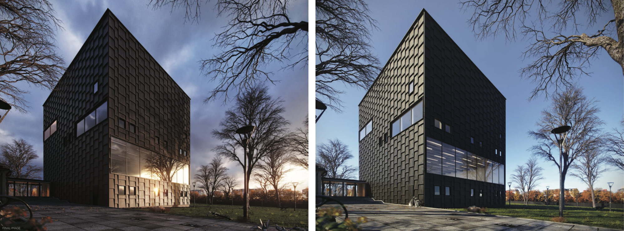
Louis Kahn’s Yale Center For British Art by Bertrand Benoit
5. Find a different angle.
There can never be a one-size-fits-all approach to composition. Using The Golden Ratio or The Rule of Thirds can be a great starting point in creating a balanced image, but many of the visuals I personally love bend these rules to achieve something more engaging and evocative. As well as with other aspects of the image, the type of client and message they want the project to convey will greatly influence composition.
Do they want to show the building as a natural extension of a neighborhood bustling with life or make it stand out, give it the appearance of an urban oasis? This will affect the placement of the camera, its focal length (for example, a low position of the camera with higher target will make the building look more imposing). I find that for most exterior views it’s important to leave enough room for the sky, as it lets the image breathe. There are many online resources exploring this subject. You might want to check out this series of portfolio reviews created by Arqui9 Visualization. Highly recommended.
Mohit Sanchaniya‘s Entry – Runner Up Tomorrow 2017 Challenge
6. Light it up.
Most commercial Archviz images I’ve created feature a sunny, daytime atmosphere, with crisp shadows and vibrant colors. I was surprised to discover that there aren’t many middle-of-the-road clients who’d like their design to channel Bergmanesque existential angst. In interior images, there are more opportunities to play with chiaroscuro, contrasts and off-beat atmosphere.
The type of light source (HDRI or Sun-and-Sky system, for example) will depend or the artist’s own workflow. Although, in my experience, HDRI’s do give an additional level of lighting finesse, with more realistic reflections and ambient lighting, I’ve seen many great images that were lit with a simple Sun-and-Sky system, or even just a few planes. Find what works best for you. This is the part of the rendering process where quality mostly depends on having a good eye, an artistic sensibility and use of photographic references.
It is also important to educate the client through this process; define expectations and explain how different elements in the scene interact with one another. Large visualization studios often start a project by first providing clay renders. These have a legitimate role in the process, but can often give a false impression of the lighting and cause misunderstandings with clients (it’s useful to remind oneself that clients don’t often understand the physics of light and software limitations).
For example, if the façade is made of white plaster, and the client requests a sunset atmosphere, the façade will inevitably receive a yellowish or orange hue. If photorealism is what is required, these physical limitation have to be taken into consideration and communicated to the client.
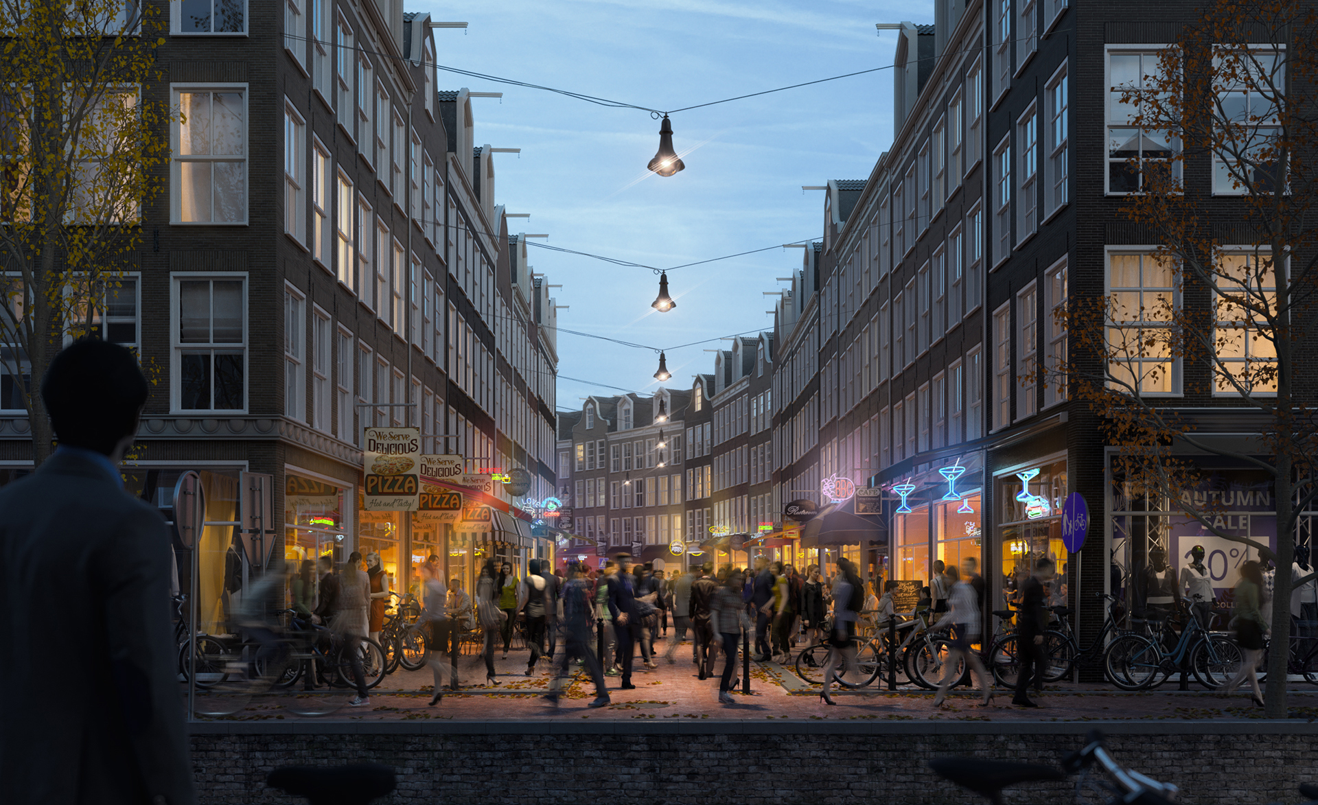
Strahinja Drazic Crowded Mini Challenge #05 Winner
7. Populate your final scene.
There is a growing number of 3D people collections out there, and the quality is getting increasingly better. One of the main problems with these so far have been ghoulish skin and unrealistic hair (I remember one client politely asking us to remove ‘zombie boy’), though there have been huge improvement on this front. In the image bellow, created using AXYZ Design’s Anima 3D scanned people, human figures bring the architecture to life without drawing the eye too much.
When it comes to 2D people, one of my colleagues explained it most aptly – When you find a good person, there is no need to waste time fixing them (We agreed that, as in life, this also works in Archviz). I find it pays to invest more time in searching for the right cutout people, instead of slaving away trying to make them fit. Obviously, they need to be lit from the right side, appropriately clothed for the season, have the right ethnicity depending on geographic region, etc. The white balance and color tone in general need to be in line with the tone of the image.
Let’s say you’re creating an image of a busy city street with lots of passersby and people sitting in terraces. While in reality people wear random colors, I believe it’s important to blend them into the image so to provide variation and sense of movement, but not be too conspicuous. Another approach is to use people cutouts sparsely, select and place them strategically to build a narrative. Don’t forget to add contact shadows. It’s tedious work, but impactful.
These bullet points just scratch the surface of good visualization practices. As with most things, it takes years, decades even to figure out all its different aspects and learn how to develop meaningful client relationships which will allow you to fully enjoy your work. The links to resources I provided are a good way to start.
Happy rendering!
Architizer's 2025 Vision Awards puts the spotlight on architectural representations — from conceptual work to photographs and videos to drawings and more. The Extended Entry deadline of August 1st will be here in no time, so start your submission today.