Architizer’s Tech Directory is a database of tech tools for architects — from the latest generative design and AI to rendering and visualization, 3D modeling, project management and many more. Explore the complete library of categories here.
At their best, renderings are an incredible medium with which to tell the story of great architecture. With amazingly powerful tools now at their disposal, architects can conjure up highly detailed, virtually photo-real iterations of their concepts in no time, wooing clients with seductive images of buildings that could be.
Of course, those technological tools are just that — tools. When those tools are misused, the resulting visualizations can lack clarity, or worse still, they can be downright deceptive. Misleading images can ultimately lead to a loss of faith between clients and the profession, so it’s crucial we get them right.
As we welcome entries for the One Rendering Challenge — enter here for a shot at $2,500 and pro rendering software — it’s worth checking your image for these rendering faux pas. Take a look at the following seven common mistakes made in architectural visualization, which even the most skilled rendering artist can be guilty of.
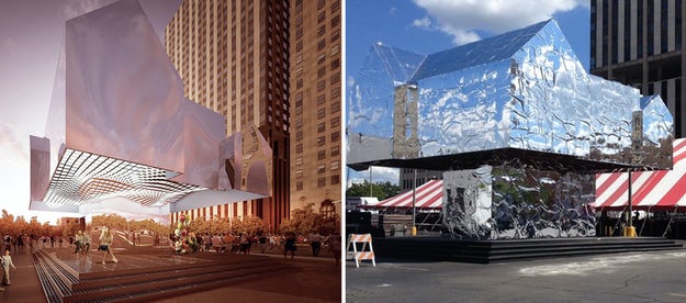
“Mark’s House” by Two Islands; left: rendering courtesy Two Islands; right: a photo that appeared in local news coverage; © Scott Atkinson
1. Rendering Reflections
Two of the most difficult materials to accurately replicate in renderings are glass and mirrored surfaces. Make mirrored façades too flawless or glass too transparent, and an image can appear misleading when compared to the finished building.
One such example sparked a huge debate right here on Architizer — a rendering for “Mark’s House,” an installation by small firm Two Islands, appeared markedly different from the completed structure, depending on the time of day and weather conditions. Such surfaces will always be a challenge to be represented honestly in visualizations, but with ever more accurate tools in their arsenal architects have fewer excuses for reflecting the material truth.
Rendering for Sky Village by MVRDV, Rødovre, Denmark; image courtesy MVRDV
2. Placing Trees on Top of Skyscrapers
The argument about whether you really can grow trees on top of skyscrapers has actually been answered by Boeri Studio, whose “Bosco Verticale” project is blossoming into a verdant urban paradise as we speak. It is not so much a question of whether we can put trees on top of skyscapers — we can — but more about how we go about presenting this idea in visualizations.
The way in which trees are represented in architectural renderings sometimes strays a little far from reality, avoiding the practical realities of combining architecture and arboriculture. MVRDV’s Sky Village in Rødovre is a case in point — are the rendered floor slabs above really thick enough to support the root system of the 12-foot-high trees upon them?
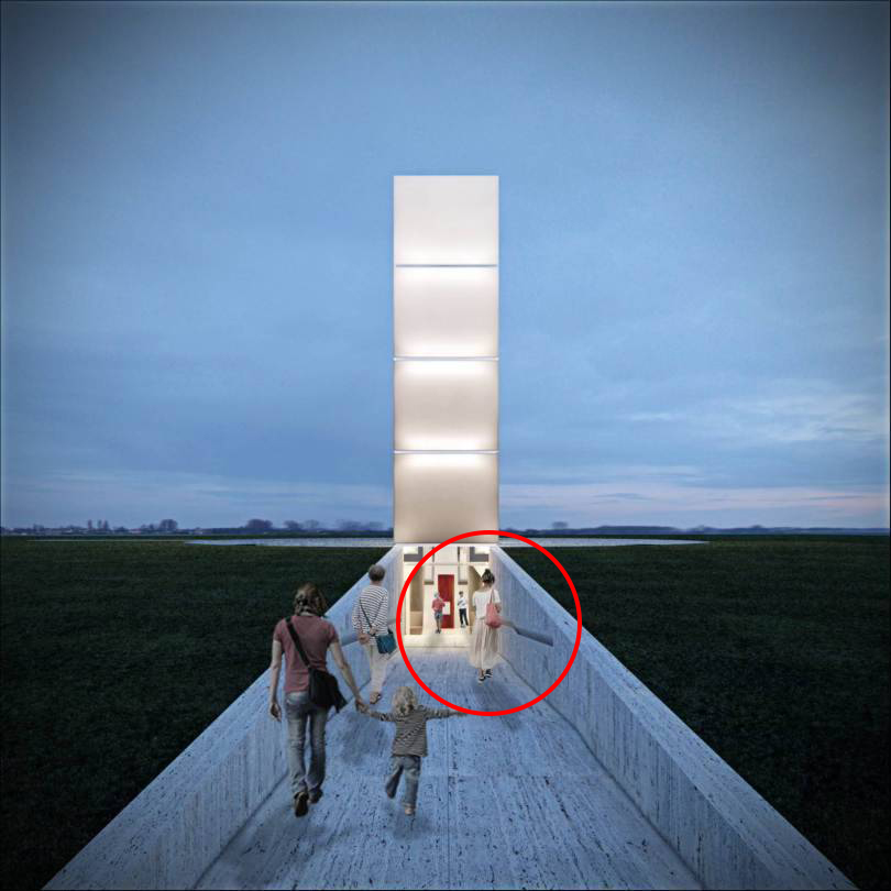
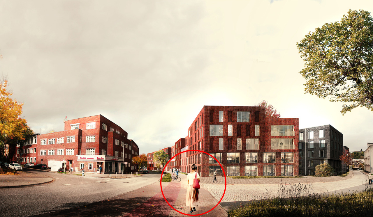
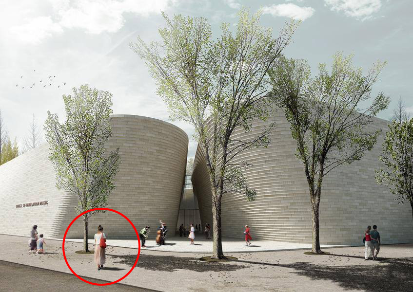
From top to bottom: Freedom of the press monument, Praca Central Brazil by Gustavo Penna Arquiteto e Associados; Bahnhofstrasse, Flensburg Germany by ADEPT; House of Hungarian Music, Budapest by AND-RÉ architecture
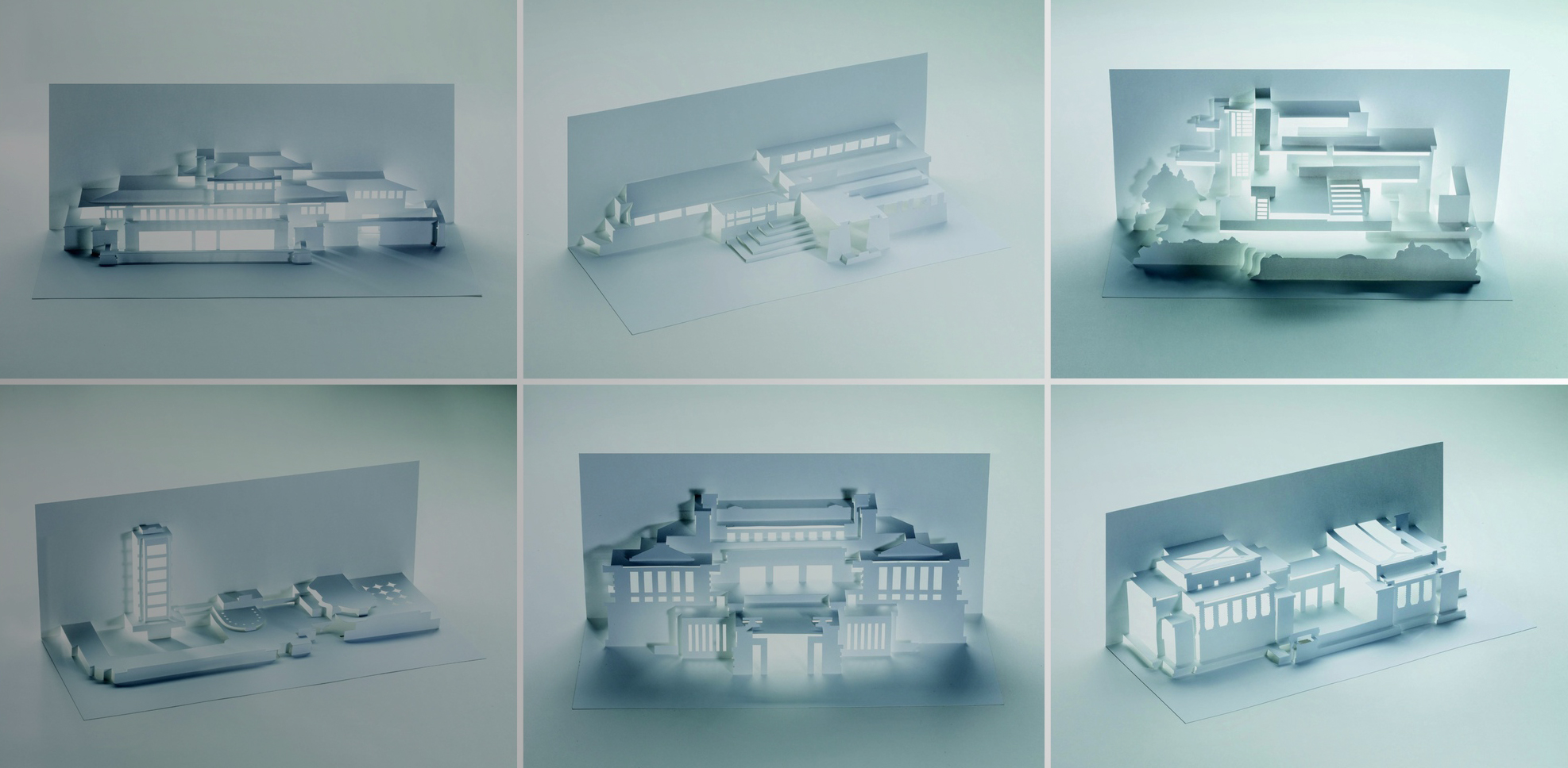
3. Recycling Scale People
Every once in a while, one scale figure in a free-to-download collection is at just the right angle — and wearing just the right clothes — to be suitable for almost any rendering, regardless of context. One such example is the (in)famous “woman in beige”, otherwise known as “little red riding bag”, who has popped up in so many visualizations recently that she now has her very own Tumblr.
There is nothing wrong with recycling a good scale figure occasionally, of course — but make sure to keep your rendering library stocked with multiple options to avoid overuse. If people viewing your visualization are distracted by playing “spot the scale figure,” they might not be able to fully appreciate your architectural concept.
Also, make sure to pay attention to context and diversity — if you are designing a project for a metropolitan city where people of many racial demographics reside, this should be reflected in your renderings. There are a growing number of resources for diverse scale figures you can pull from.
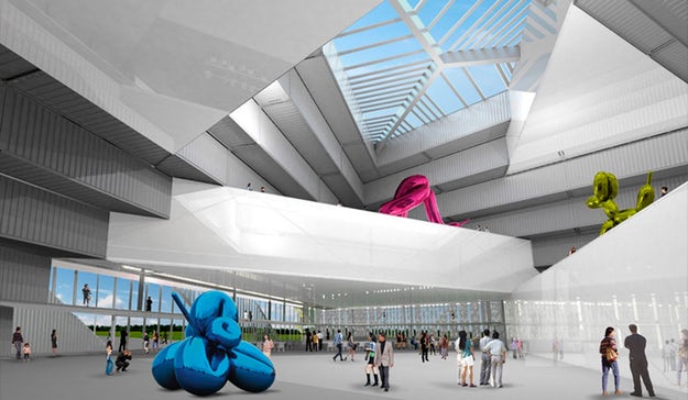
An entry into the Taichung Museum competition by LOT-EK; via designboom
4. Recycling Scale Sculptures
Just as with those ubiquitous people, other props within your renderings should be used in moderation. Jeff Koons sculptures are a popular choice for rendering artists illustrating new gallery spaces, since they offer a good sense of scale and their bold colors contrast nicely with the backdrop.
However, this has its drawbacks — Koons sculptures have become a cultural cliché, hastily pasted into a scene as a generic prop in lieu of a more context-specific artwork. Furthermore, those characteristically garish colors can be a distraction from what should be the main event in your image — the architecture itself.
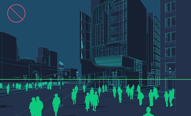
An image from Alex Hogrefe’s tutorial on perspectives in architectural visualization
5. Taking the Wrong Perspective
To create an immersive, believable visualization, using the correct camera angle is incredibly important. Rendering expert Alex Hogrefe succinctly described a common rendering pitfall to avoid in his guide to creating powerful perspectives, telling us: “Don’t be a giant.”
“For the above image, the camera is set around 10 feet above the ground,” points out Hogrefe. “It is hard to tell if the camera is placed on a balcony, if it is being held by a giant or being taken by a low-flying drone. It is important to clarify the intent by either dropping it to eye level or raising it up to 25 or 30 feet.”
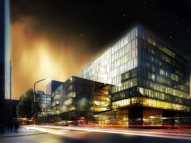
Schmidt hammer lassen architects’ rendering of their Waterfront Development in Shanghai; image courtesy schmidt hammer lassen architects
6. Going Sci-Fi Crazy
A more subjective point than those previously mentioned, the atmosphere within a rendering can drastically improve — or detract from — the quality of a visualization. An evocative atmosphere can tell a powerful story about an architectural concept — but sometimes this principle is taken a little too far.
An increasingly common phenomenon within the industry is to create scenes that look like they came straight out of a science-fiction movie, with otherworldly lighting and extraordinary weather. While this can look impactful, it can also distract from the architecture you are trying to illustrate. In the words of a certain Mies van der Rohe, sometimes “less is more” when it comes to renderings!
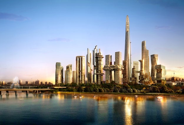
A rendering for Studio Libeskind’s Yongsan Business District, Seoul, South Korea; courtesy Studio Libeskind
7. Entering Uncanny Valley
Photo-realism is now more achievable than ever in architectural visualization thanks to powerful hardware and advanced software now prevalent in our industry. This is advantageous for creating images that virtually mirror a real-world design — but is it the best way to communicate an initial design?
While a glossy, realistic rendering can convince a developer to invest in your project, the original purpose of architectural drawings and images should not be forgotten — they should tell the story of an idea, communicating a conceptual narrative. That means that if a diagram, sketch or physical model can communicate your design better than a polished visual, you should steer clear of uncanny valley in favor of clarity.
Architizer’s Tech Directory is a database of tech tools for architects — from the latest generative design and AI to rendering and visualization, 3D modeling, project management and many more. Explore the complete library of categories here.
 25 Best Architecture Firms in Germany
 30 Best Architecture Firms in Ireland
 How an Award-Winning Architectural Visualization Studio Is Evolving in the Age of AI
 Southern Hospitality: 6 Charming Examples of Georgia’s New Class of Single-Family Homes
 The Future is Modular: Factory-Built Architecture is the Way Out of the Housing Crisis