
The winners of the 13th Architizer A+Awards have been announced! Looking ahead to next season? Stay up to date by subscribing to our A+Awards Newsletter.
Color transforms how we experience architecture. The spaces around us are defined by colors that shape what we see and how we feel, and they also work together. As a sensory perception, the effects of color range from the symbolic and associative to synesthetic and emotional. Whether they are produced through different materials or by applying paints and coatings, colors work together to shape our perspective.
Color acts in three primary ways: Active, passive or neutral. It can affect people differently depending on your personal perception of space, as well as your location and climate. To begin designing with color, there is a range of considerations to keep in mind. The following five tips are designed to help you begin selecting materials and colors to create a desired effect. These pointers also include built examples illustrating each idea from around the world.
1. Research Color Schemes
When thinking about how to design with color, it’s important to understand basic color schemes. Monochromatic color schemes are made up of different tones, shades and tints within a specific hue. These are the simplest color schemes to create, as they’re all taken from the same hue.
Complementary schemes are created by combining colors from opposite sides of the color wheel. In its basic form, a complementary scheme consist of only two colors, but can be expanded using tints, tones and shades.
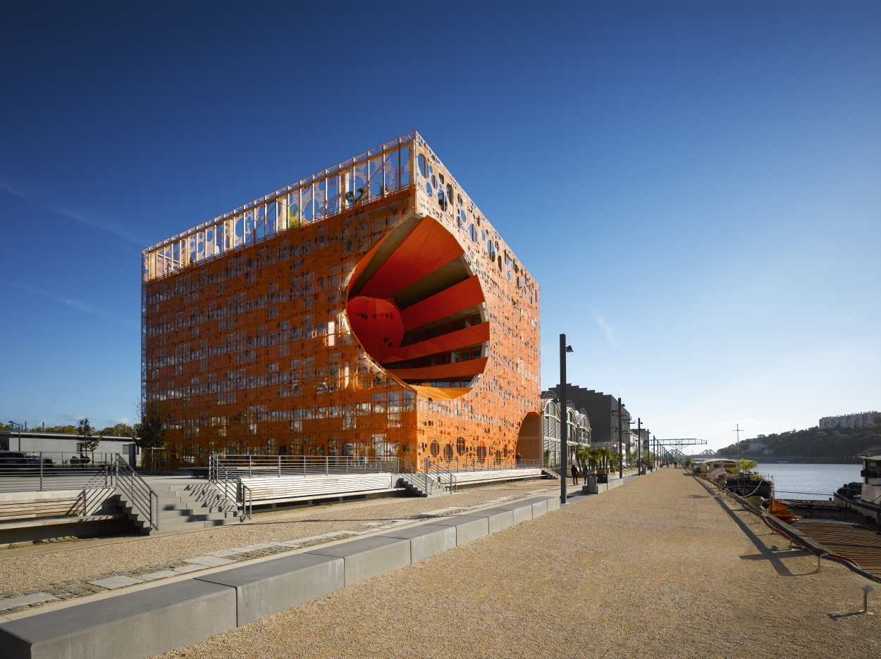
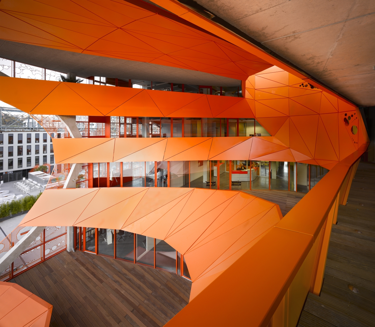
The Orange Cube by Jakob + MacFarlane
Beyond these two basic types, there are split complementary, triadic and tetradic, or custom schemes. Check out TMD Studio’s in-depth guide for more on these ideas. Understanding schemes will help you decide what materials and colors go well together. Or, if you’re curious to see how color can transform your personal space, consider hiring a professional color consultant to explore your options.
Making a bold statement, Jakob + MacFarlane designed The Orange Cube to reinvest in the docks of Lyon and bring together architecture with cultural and commercial programming. The monochromatic orange color refers to an industrial paint often used for harbor zones, and the scheme choice creates a striking addition to the context.
2. Visual Weight, Inside & Out
Adding visual weight through color can happen outside or inside a building. In interior design, texture is derived from touch. Rooms with texture hold visual weight; whether it’s an object or space, it draws attention to itself. Designers should consider how the elements of a project relate to one another and add visual weight, including along a streetscape.
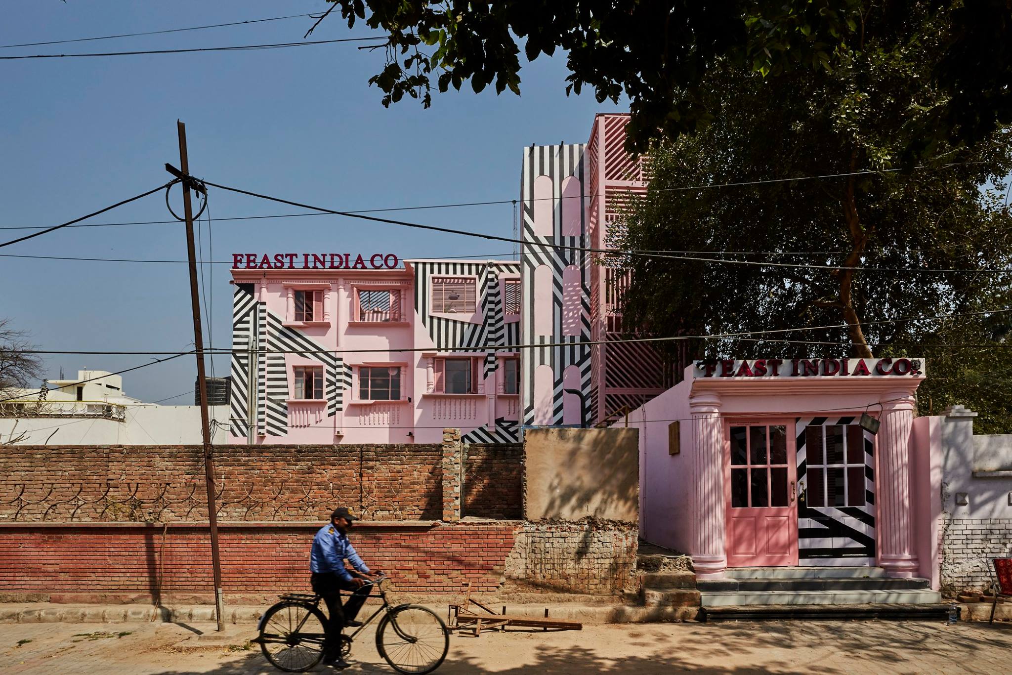
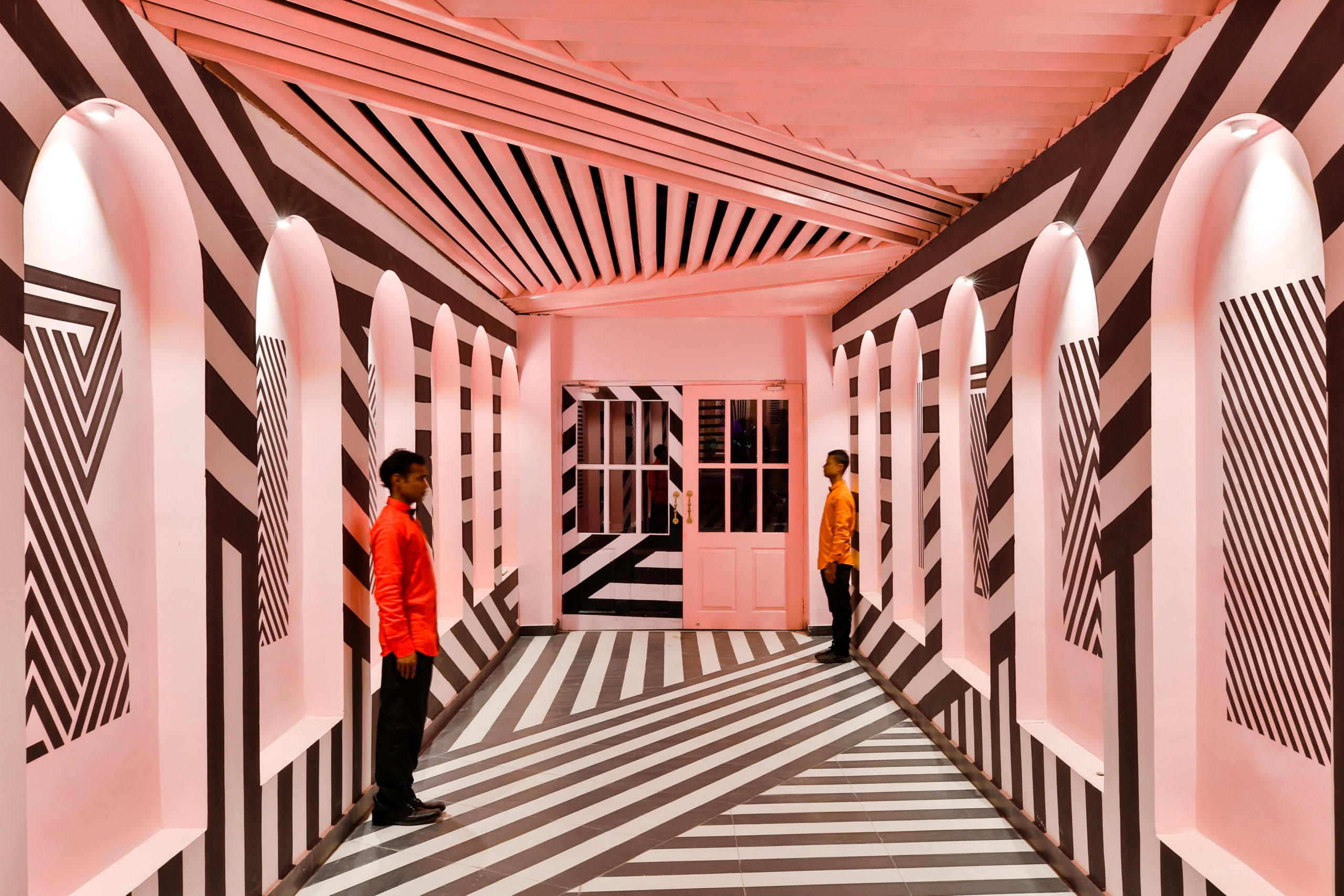
The Pink Zebra by Renesa
In Renesa’s adaptive reuse and retail space in Kanpur, The Pink Zebra combines pattern, color and texture to create visual weight inside and out. The simple idea was to create a distinct aesthetic and architectural style that connects to the city through a bold color and pattern combination. The design team wanted to make a unique facade and interiors that draws the attention of passersby and invites them in.
3. Embrace the Fifth Wall
Aside from religious architecture and iconic examples like the Sistine Chapel, ceilings have long been either white surfaces that were placeholders for lighting, or natural materials used for construction. They are often missed design opportunities, sometimes referred to as “the fifth wall.” Ceilings provide another dimension for architects and interior designers to work with: They can articulate a room’s shape, scale and proportions to divide and define spaces.
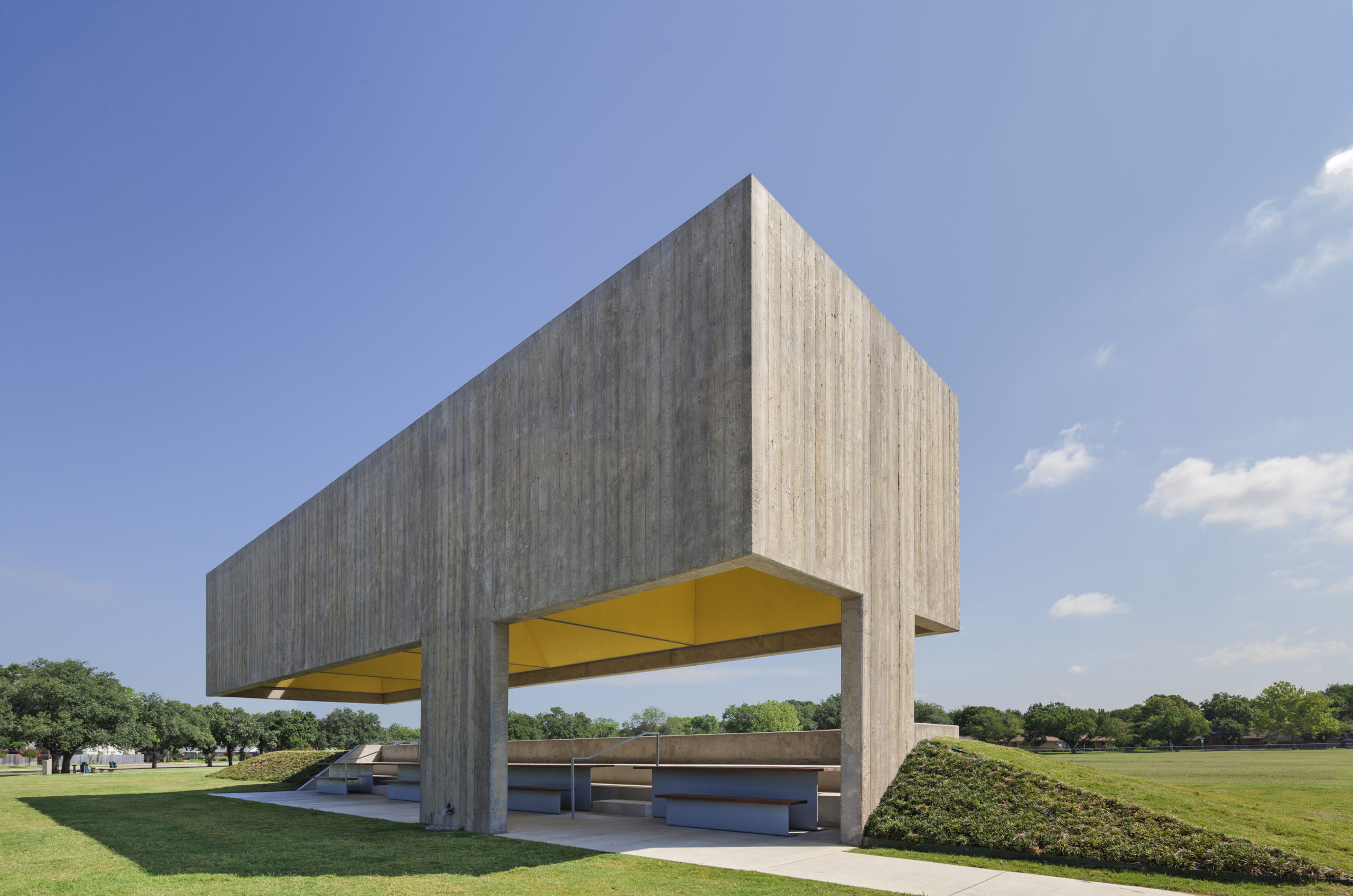
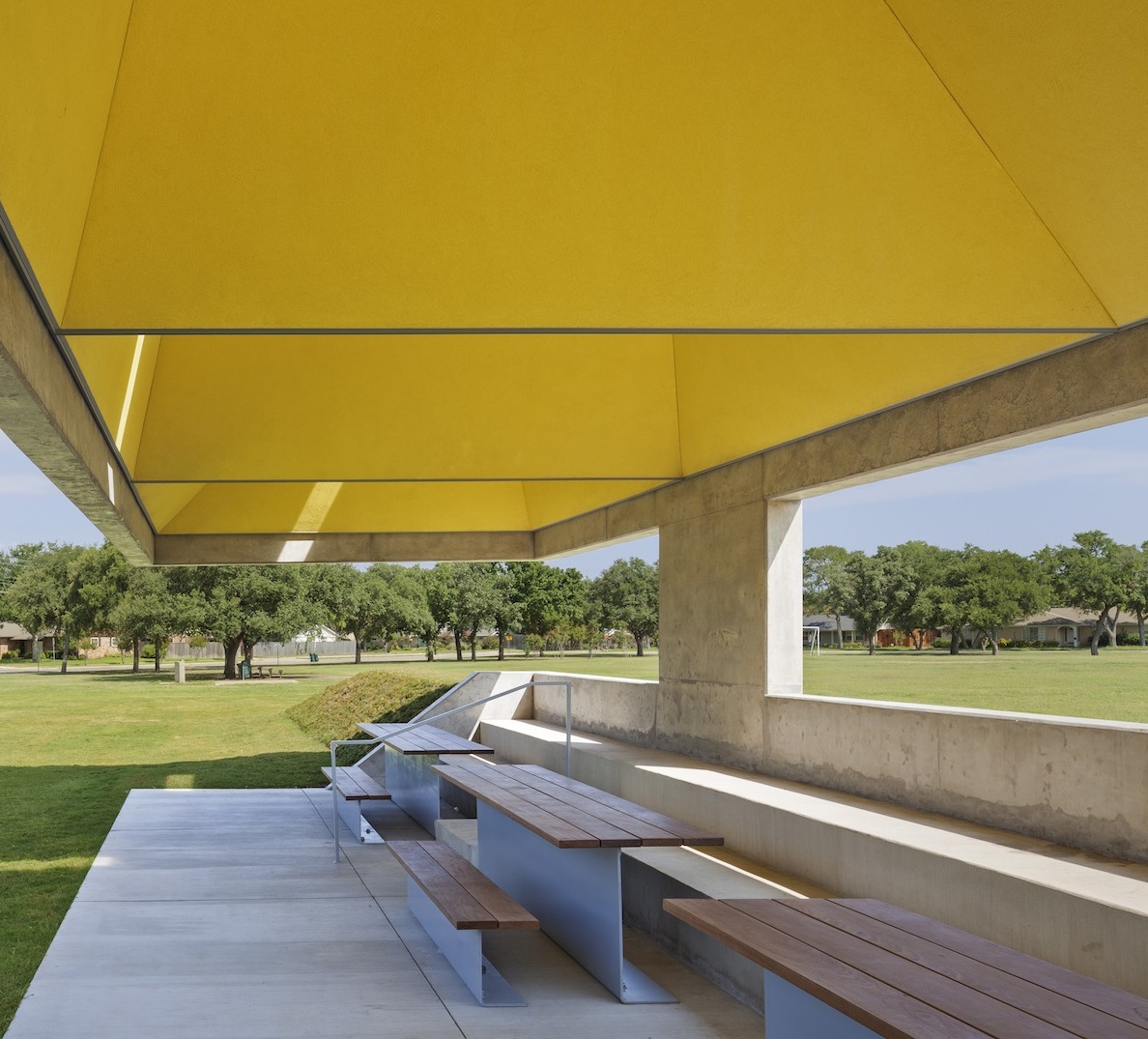
Webb Chapel Park Pavilion by Studio Joseph
The Webb Chapel Park Pavilion is an excellent example of using color to draw attention to this fifth wall. Studio Joseph made the heavy shell of concrete open to reveal four playful, pyramidal voids in the roof. Not only a surprise of color, the ceiling serves as a natural ventilation system based on a traditional “palapa:” encouraging the hot Texas air to move through the pavilion. Convection breezes are increased as the bold volume perceptually lifts away from the ground.
4. Understand the Psychology of Color
Color makes a small room feel larger, or a spacious one feel more intimate, and you can design a space so that it fits the right scale for your desired concept. When used in the right ways, color can even save on energy consumption.
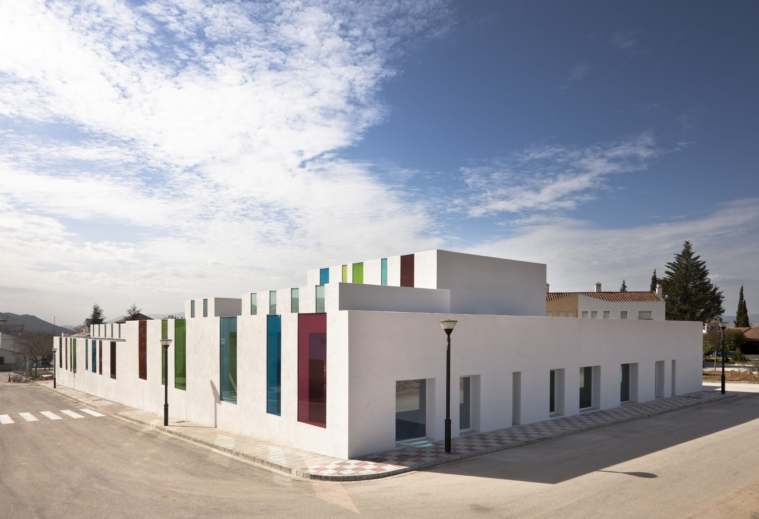
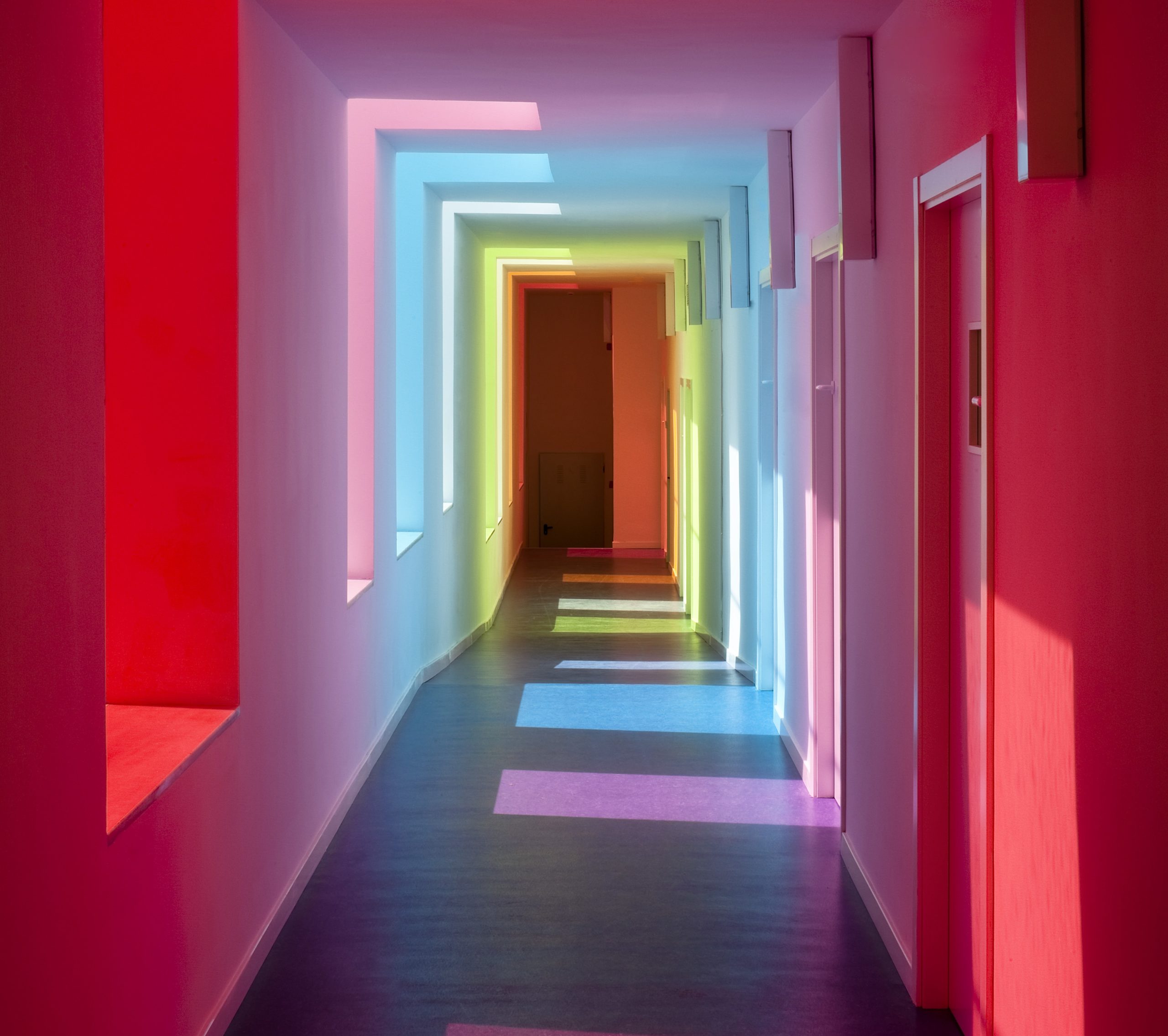
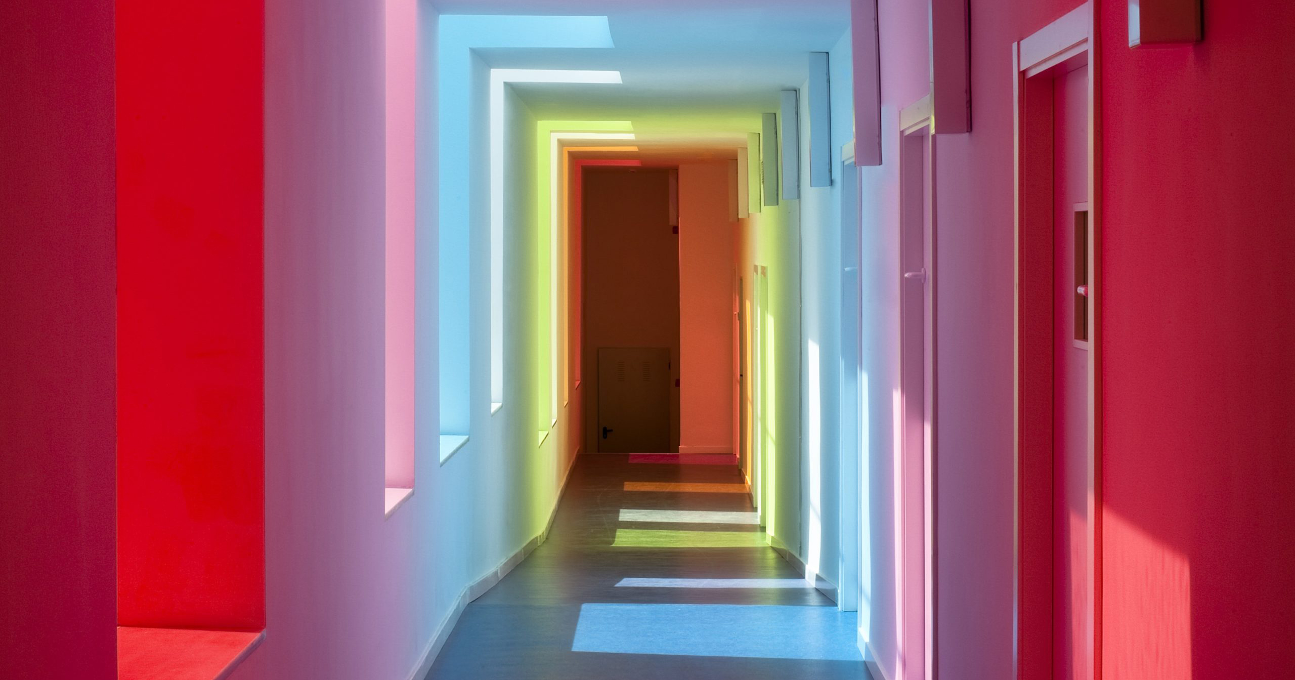
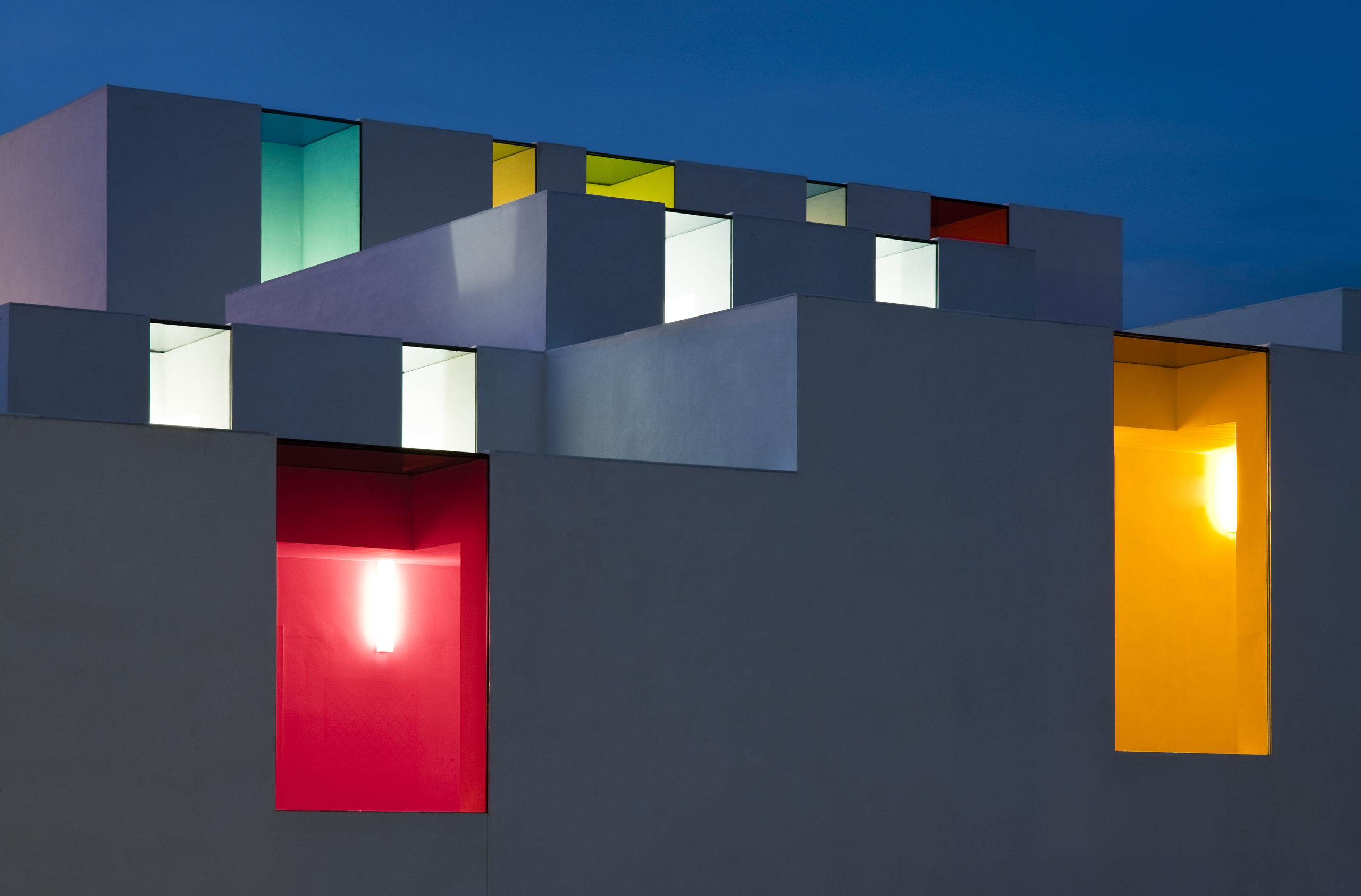
Educational Center in El Chaparral by Alejandro Muñoz Miranda
As part of Alejandro Muñoz Miranda’s airy Educational Center in El Chaparral, the building’s orientation in space and treatment of light and void makes the classrooms uncompressed glass appear. These colorful “fissures” in the facade mean that controlled light will be colored in dynamic areas of the corridor or in the outside covered playground. Inside the classroom, these cracks change the atmosphere and spatial experience.
5. Bring it All Together
It’s important to remember that color doesn’t exist in isolation. While you can use it to highlight a specific surface or space, it’s part of a larger interior design approach and contextual response. Color can bring psychological, environmental and sustainable benefits, and at the same time, work with diverse materials and assemblies.
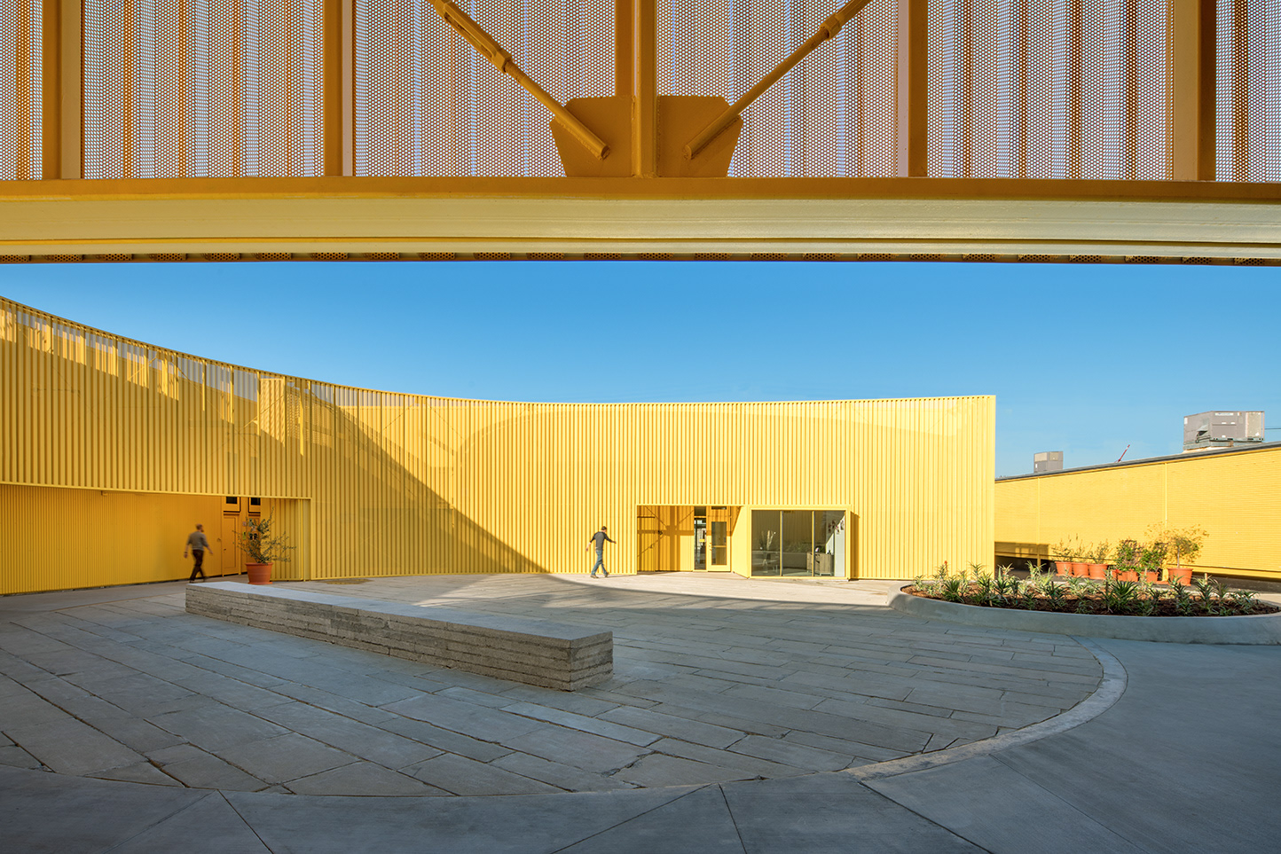
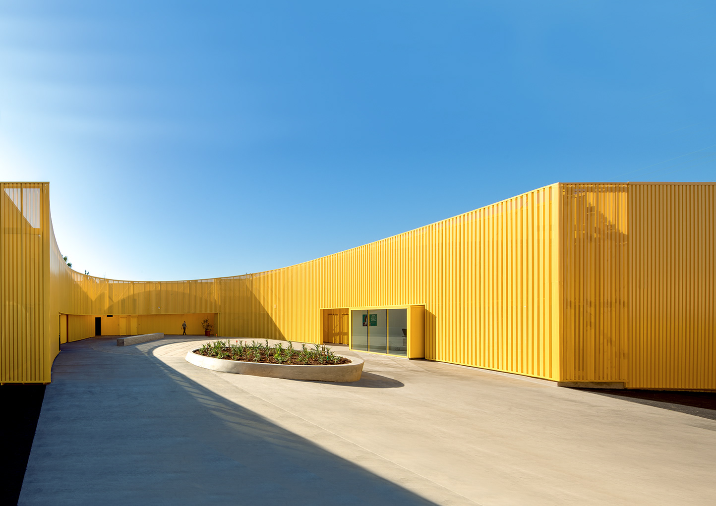
South Los Angeles High by Brooks + Scarpa
In Brooks + Scarpa’s new South Los Angeles High, the perforated, yellow aluminum façade panels of the building creates an ever-changing screen that sparkles in the sun and glows at night, while simultaneously providing shade to cool the building, reducing noise, enhancing privacy but still allowing for views, great natural light and ventilation through its millions of perforations. The material reappears as a strategic arrangement of screens around the building, lending a subtle rhythm to the exterior circulation.
For more vibrant examples of colorful architecture around the world, check out The Color of Architecture: 72 Projects Spanning the Spectrum.
The winners of the 13th Architizer A+Awards have been announced! Looking ahead to next season? Stay up to date by subscribing to our A+Awards Newsletter.
 Educational Center in El Chaparral
  The Orange Cube
  Webb Chapel Park Pavilion