
Browse the Architizer Jobs Board and apply for architecture and design positions at some of the world’s best firms. Click here to sign up for our Jobs Newsletter.
If you had to name an online platform upon which architectural discussion might thrive, the image-sharing community of Imgur probably wouldn’t be the first website to cross your mind. Nevertheless, one seemingly farcical post on the site prompted a debate about the built environment in the most unexpected of ways. The image presented was something resembling an architectural floor plan, accompanied by two sentences:
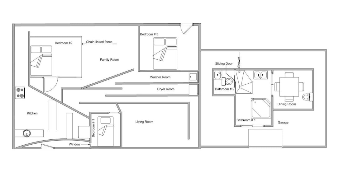
“For school, I was assigned to make the worst floor plan for a house possible. I got an A.”
The floor plan in question is full to overflowing with absurdity: Bedrooms are shrouded in darkness, the circulation spaces are maze-like, the dining room can only be accessed through the bathroom … and there is just one window. Needless to say, it’s not positioned where it might be useful. The details are no less infuriating. Beds are pushed against doors, kitchen units are wedged awkwardly between angular walls and in order to access the WC, one must walk through the shower. Still, at least the square footage is higher than your average New York apartment.

“The Worst Floor Plan Ever”; via Imgur
The joke is a simple one but garnered an extraordinary amount of engagement from the Imgur community. It has been viewed more than 650,000 times — more than most real-world floor plans, no doubt — and amassed almost 400 comments in the first 24 hours after its publication. While the majority of feedback on the image took the form of amused appreciation and faux outrage, something else occurred: A number of users began to break down exactly why this floor plan is perfectly terrible.
“I’m ashamed that it took me so long to notice that there actually isn’t a way into the main part of the house,” wrote one user in the forum. Another lamented its “obstacle-course kitchen,” while dozens pointed out the ludicrous journey necessary to bring meals from the kitchen to the dining room. On the other hand, some were less critical. “I kinda like the idea of a toilet in the dining room. Saves time,” mused a more positive user, while another pointed out that “at least the living room is spacious; just got to get through the labyrinth to get there. Watch out for Bowie!”

The floor plan is now submerged in an ocean of architectural memes that have since flooded the internet — but its premise provokes some interesting questions for studying architecture. By being asked to deliberately create a patently awful design, architecture students are forced to ask themselves: What is important to end users? What are the priorities in ensuring comfort conditions for the inhabitants of new residential developments? And what happens when an architect gets those priorities wrong on the most fundamental of levels?
While one might dismiss this whimsical assignment as a folly that would never come to pass, it is worth bearing in mind that bad floor plans exist in very real buildings across the world. Realty blogger David Fleming highlighted one in a post fittingly entitled “World’s Worst Floor Plan!,” namely a one-bedroom apartment in the Atrium Condominiums in Fleming’s home city of Toronto, Canada. In an effort by developers to monetize every last square foot available to them, the compact dwelling is squeezed into that most abhorrent of shapes: a triangle.

The offending apartment in the Atrium Condominiums boasts great views of the CN Tower in downtown Toronto — but at what cost?; plan and image via Elizabeth Goulart.
Fleming broke the plan down. “The bedroom is barely large enough to fit a bed,” wrote the exasperated blogger, “and while they’ve eliminated the triangle-shape by putting a closet in the corner of the triangle, thus squaring the wall, we can’t ignore that the room has no window!” Things don’t get any rosier when assessing the main living space.
“First, consider that most agents would call this ‘living/dining,’ even though you can barely fit a chair and a TV. Secondly, look closely and you’ll see that your couch would have to be adjacent to your kitchen appliances or two feet from your toilet and sink.” In case the floor plan is not enough to convince you that this apartment layout is problematic, the video below provides a real-world walkthrough of the apartment, revealing what it is really like to move through this space.
A walkthrough that Fleming describes is the “World’s Worst Floor Plan.”
Custom furniture seems a must here. Fleming suggests acquiring “your grandmother’s oak corner-cabinetand maybe all the Royal Doulton figurines that come with it” — but even the most optimistic of realtors should admit that this kind of layout is virtually unlivable. Perhaps if more developers and their architects were instructed to carry out the assignment described on Imgur, they would be forced to consider the experience of those that will ultimately inhabit the spaces they create. A site visit to the Atrium Condominiums in Toronto wouldn’t go amiss, either.
What is the worst floor plan you’ve ever come across? What do you think should be the top priorities for architects when designing apartments in urban centers? Should developers be held to account with more regulations to assure their properties meet certain living standards? Let us know over on Facebook.
Browse the Architizer Jobs Board and apply for architecture and design positions at some of the world’s best firms. Click here to sign up for our Jobs Newsletter.
 25 Best Architecture Firms in Germany
 30 Best Architecture Firms in Ireland
 How an Award-Winning Architectural Visualization Studio Is Evolving in the Age of AI
 Southern Hospitality: 6 Charming Examples of Georgia’s New Class of Single-Family Homes
 The Future is Modular: Factory-Built Architecture is the Way Out of the Housing Crisis


